Principle 1:
Attention
author
Charlotte
3 April 2019
The 7 Principles of Conversion-Centered Landing Page Design: Attention
Attention: the first principle of conversion-centered design.
An eye-wateringly expensive marketing campaign is worthless if it doesn’t grab people’s attention. As the great Steve Rubel once said, “Attention is the most important currency anybody can give you.”
That’s why any campaign’s landing page needs a good attention ratio. Or else your readers will swan off to somewhere more exciting.
“What’s attention ratio?”
An excellent question. But before we give you the answer, if you haven’t read ‘An Introduction to Conversion-Centered Design and the 7 Principles’, do it now. It’ll help you get to grips with this article.
We’ll put the kettle on whilst you catch up…
…Done? Okay, cool. So now you know how attention fits into conversion-centered design (CCD).
Attention ratio is the number of things you can do (aka the links you can click on) on a given page against the number of things you should do. Your marketing campaign’s landing pages, should only have a single goal (meaning all other distractions on the page are eliminated), and the attention ratio should be 1:1 to increase customer conversions.
Homepages usually have poor attention ratios. And that’s okay. Their job isn’t to direct visitors to a single point. They’re navigation tools that lead people to other pages on the site and help you showcase your personality a bit more.
Of course, you can run a marketing campaign on your homepage. But if your campaign is focused on achieving one thing, this is a bad idea. You can only achieve a 1:1 attention ratio from a landing page because landing pages are designed to accommodate a single goal.
Homepages, on the other hand, usually have a ratio of anywhere between 10:1 to 100:1.
When you compare landing pages to homepages, it’s easier to see how we get from a poor attention ratio to a good one.
What a poor attention ratio looks like.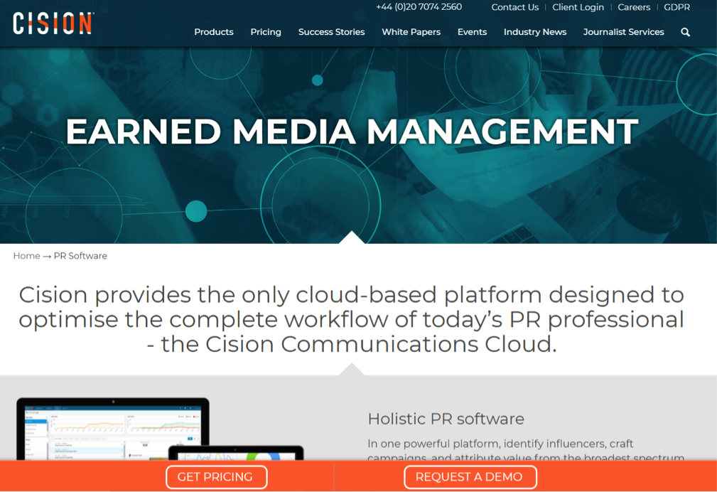
Source: Cision
The image above is of Cision’s homepage – a PR software company. It has an attention ratio of 54:1 – that’s 54 different paths for people to explore. Also, within those links are three call-to-actions (CTAs): ‘Get Pricing’, ‘Request a Demo’ and ‘Learn How’.
Let’s say we turned one of those CTAs into a link for a marketing campaign, the goal of which was to get visitors to complete a contact form for a free whitepaper. How healthy do you think the click-through rate would be? Well …

The tumbleweed has spoken. There are simply too many links fighting for the visitor’s attention for the campaign to succeed. The visitor will tune out and click off.
Remember, the above example is a homepage, so it’s no surprise that its attention ratio is high. But plenty of people make this mistake with their landing pages, too.
What a good attention ratio looks like.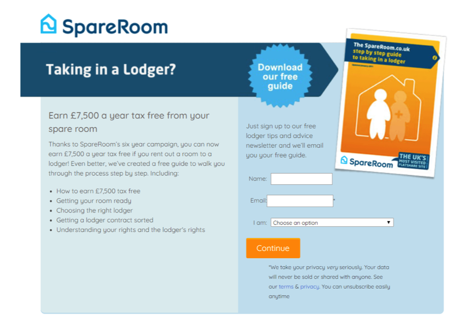
Source: Spare Room
Now THIS is a good landing page. Spare Room has one goal: to get visitors to download its free guide. And that’s literally the only thing you can do on this page, giving it a beautiful 1:1 attention ratio.
This doesn’t mean that the campaign will be a huge hit: there are six more principles of customer-conversion design to get right. But it does ensure that visitors aren’t distracted by other possible actions, increasing the chances of the campaign’s goal being met.
A/B testing concurs
You might have heard about A/B testing before. A lot of online marketers use it to compare two versions of a single variable. (For example, testing an email with two different CTAs to see which is most effective.) The results gained help marketers make smart decisions to boost engagement or customer conversion rates.
Software company Unbounce used A/B testing to see how the attention ratio effects conversions by comparing two ebook landing pages. Variant A had several links to related content and a few social share buttons. These links were removed from Variant B.
The attention ratio test was 10:1 vs. 1:1.
Variant B saw 31% more ebook downloads than Variant A.
In another A/B test conducted by VWO, the company saw a 100% increase in conversions after removing additional page navigations (the attention ratio dropped from 15:1 to 3:1).
The verdict? Based on these two examples, a good attention ratio makes a huge difference when it comes to the success of a campaign.
Can you ever benefit from a higher ratio?
Yes, there are exceptions to the 1:1 rule.
The most obvious one is repeating your CTA button throughout a long landing page. The copy doesn’t have to be the same on each button – you could experiment with different phrases to see which one gets the most clicks. As long as each button can complete the same action, this can be effective in increasing customer conversions.
How attention ratio applies to email campaigns.
If you’re running an email campaign, attention ratio needs to be considered if you want to convert recipients. Saying that, it’s essentially impossible to get a 1:1 ratio for email newsletters because there are distractions you can’t remove, like open tabs and links on email interfaces.
So you only have one option: to get that ratio as small as possible. Take a look below to see how Uber Eats managed it:
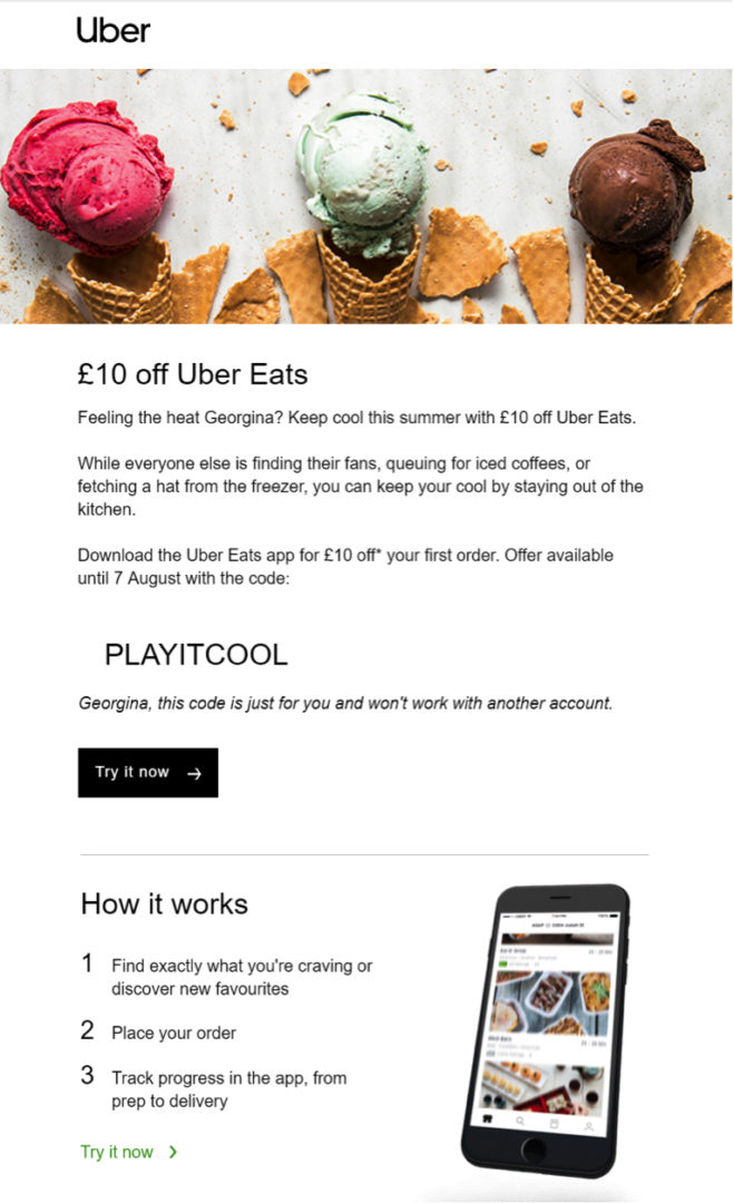
There are two CTA buttons here, but both lead the recipient to the same page (Uber Eats’ homepage). Aside from that, there are no other CTA buttons on email, giving it an attention ratio of 2:1. Not bad, huh?
Thanks for your attention
It was worth it though, wasn’t it? You’ve taken the first step in nailing conversion-centered design.
The second step is Context, where you’ll learn how to create a strong contextual bond on your landing page with the source of your marketing campaign, so visitors feel reassured they’ve made the right click.