Principle 3:
Clarity
author
Charlotte
10 June 2019
The 7 Principles of Conversion-Centered Landing Page Design: Clarity
Clarity: The third principle of conversion-centred design.
When clarity is missing, bad things happen.
Like when you forget to label your lunch and someone else claims it. Or when you fail to correct a mistranslation of a $10 million rebranding campaign that turns “Assume Nothing” into “Do Nothing” (we’re looking at you, HSBC).
This is why clarity plays a huge role in conversion-centered design (don’t know what CCD is? Then you read this).
If your visitors struggle to understand your offering or what you want them to do, your back-button will see more action than a rock star’s four-poster.
Getting clear on your campaign proposition.
Your campaign should have one big goal that’s communicated via your landing page. We call this your unique campaign proposition (UCP). Sound familiar?
You might be thinking of your unique selling proposition (USP) – the reason behind why your business is special. It’s your homepage’s job to broadcast your USP.
A unique campaign proposition sells the purpose of your marketing campaign. Nine times out of ten, this is different from the value proposition of your homepage.
To illustrate: for an event registration offer, you want to cover who the event is for and why people should attend, not your business’ product or service.
Putting it simply:
Homepage: communicate USP
Adverts and landing pages: communicate UCP
This will help you maintain clarity.
The impact of information hierarchy.
Clarity also relies on the order with which you present your copy, literally (which words come first?) and visually (what words or graphics stand out most?).
We call this ‘information hierarchy’ and it’s something a lot of businesses get wrong when designing a landing page.
Take a look at the email pull-out below for instance:

Source: StressNoMore
As you can see, the heading says ‘Newsletter Exclusive!’ in this email which is advertising discount codes. It’s also much more attention-grabbing than the subheading below thanks to its bold dark font, use of capital letters and an exclamation for good measure.
But is this information important? And does it clarify what the email is offering? Nope. You have to read the subheading to understand what the email is trying to tell you – and even then it’s vague.
Let’s also talk about the placement of the picture. Not only is it taking up a lot of space but it precedes an explanation of the offering. Which makes this ambiguous image higher in the information hierarchy than the actual UCP (“We’ve got some savings for you”).
Combine both these problems and you get a huge clarity fail: your offering loses power and visitors won’t be as compelled to find out more.
Measuring information hierarchy.
Five-second tests make investigating clarity issues easy. With access to the Usability Hub, you can give a group of participants five seconds to view your landing page or advert’s design. Once the five seconds are up, the participants need to answer some simple questions dictated by you.
Your goal is to work out how clear your information is based on its hierarchy and visual impact. For example, you could ask the question: “What is the offer?” or “What does the product do?” Participants will answer your question based on the information they’ve processed from your design in five seconds.
If the majority of participants give you the correct answer, that’s a sure sign you’ve nailed clarity through good information hierarchy. If they’re clueless, you need to go back to the drawing board.
Show that information who’s boss.
These neato tips will help you tell your story in the right order to deliver clarity for your visitors:
Communicate your UCP through keywords in your heading. For example, if you’re offering a way to ‘create professional emails’, ensure that phrase is featured in your heading and not just your subheading.
Don’t let a vague image steal the limelight. If you’re using a stock image as a background for your UCP, pick one that doesn’t take over the design and that supports the content you’re writing.
Choose your font wisely. If the font you use for your subheading supersedes that of your heading (which should shout about your UCP) your offering will lose its authority.
Avoid information overload. You might think it’s a good idea to plaster your offer in a hundred different ways all over your design. But that’s a recipe for confusion, not clarity. Stick to one or two clear sentences that communicate your UCP clearly and drive those click-throughs.
Being cute or clever will only get you so far.
Keep your campaign ads clear, not clever. Save that for your Cannes Lion entry that’s intended to impress judges, not real people. Otherwise, your UCP might be as misleading as a Daily Mail headline.
Another clarity rule of thumb: don’t be a jargonaut. As the acclaimed content marketer Ann Handley puts it:
“Buzzwords and jargon are the chemical additives of writing.”
Let’s illustrate why using the example below:
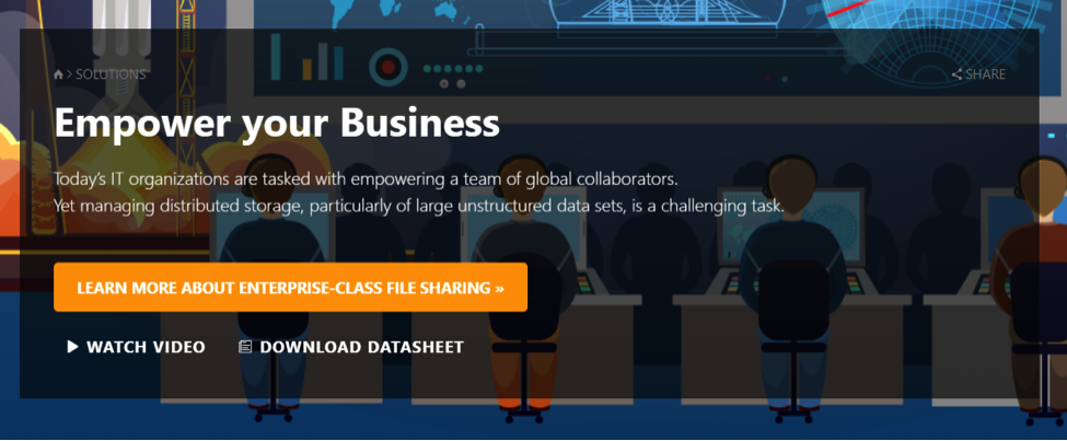
Source: Talon Storage
“Empower your Business” … *shudders*. Why does this make us recoil in horror? Because it’s utterly meaningless. It offers zero value to the visitor – this is the penalty of using jargon.
Meanwhile, the call to action’s copy explains the offering succinctly: “Learn more about enterprise-class file sharing”. By simply replacing the headline with the CTA’s content, the UCP is relayed 100% more effectively.
A jargon-busting tool.
Need a bit of help identifying jargon? The software company Unbounce has created a Chrome extension that can highlight offending phrases. You can run it on your landing page or website to pick out those wishy-washy words and replace them with more specific, more persuasive copy.
However, this isn’t to say that jargon doesn’t have a place in your copy. For example, if you own a B2B business in IT, technical terms will help you communicate better with your brethren. Use your best judgement to find a balance between clarity and jargon to become a smooth communicator.
You’re one step closer…
Now you understand how the power of persuasion lies in clarity. Which means you’re well on your way to mastering conversion-centred design. Exciting, huh?
The next principle is congruence – the focus of our upcoming blog in this series. Read it and learn why aligning every element of your campaign’s design with your UCP is crucial for customer journeys.