Principle 6:
Closing
author
admin
7 June 2020
The 7 Principles of Conversion-Centered Landing Page Design: Closing
Closing: The sixth principle of conversion-centred design.
To click or not to click, that is the burning question on you’re visitor’s mind right now.
You’ve convinced them that your offering is worth their time by being clear, concise, compelling and credible via your landing page (that’s if you’ve been following the previous five principles of customer-conversion centred design).
But the work isn’t over yet. You need to present one last hell-yes reason why visitors should make that all-important click.
Understanding the psychology involved in making a decision to convert is key. Let’s dive deeper into the opposing and supportive influences.
Negative influences.
A negative word, phrase or visual element is your worst enemy in this late stage of the landing page experience. When placed near the CTA, it gives the visitor a reason to pause as they decipher its meaning.
Here are some examples of such words:
“Spam”
“Junk”
“Attention”
“Don’t forget”
“Action required”
“Late”
“Ignore”
“Refuse”
“Required”
“ASAP”
And these are commonly used phrases that include stop words:
“Join ASAP for the best deals this winter”
“Action required to claim 40% off your next purchase”
“Don’t forget to claim your free gift”
In the first instance, these phrases seem compelling – they’re urging the visitor to take action, encouraging them to convert.
But because stop words induce anxiety, users may be compelled to do a Forrest Gump rather than complete your desired action.

You may even have stop words in your privacy policy. For example, near your CTA you might state:
“Please read our privacy and spam policy to understand how your personal information is used.”
“Hold up, should I be worried about ‘spam’?” is what your visitors will think when confronted with this phrase or something similar.
Along the same thread, trust seals (stamps of approval or certification) can be perceived as desperate if you use too many, making the visitor wonder why you’re trying so hard to convince them.
Positive influences.
Minimising anxiety at this critical stage can put the odds of a successful conversion in your favour. And it goes a bit further than simply removing negative words.
You need to include soothing reassurances. Statements like: “We’ll respond to your enquiry within two hours” are golden because you’re being explicit about how long it will take for you to respond. Now the visitor has a solid reference point, if you live up to this promise, you’ll successfully earn their trust.
Or let’s say you’re asking visitors to sign up to a webinar. By advising that the session will be recorded, you convince visitors that they don’t need to be anxious about missing out.
Similarly, if you’re asking prospects to invest in a product or service via your landing page, it’s worth mentioning your returns policy or dissatisfaction guarantee, so customers understand what they’re getting themselves into and how you’ll take care of them post-sale.
Super-clickable call-to-action copy.
“Words can inspire. And words can destroy. Choose yours well.” – Robin Sharma
Too true. The words you include on your call-to-action (CTA) button will make or break your campaign.
Remember, your CTA’s job is to compel visitors to act now. It’s critical that you’re clear and concise. Write a mouthful or be too clever and people will lose their interest.
Look at this example of CTA copy:
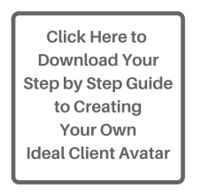
Source: Blake Consultants
There’s no sugar-coating it: this CTA button is a disaster. “Click here” is unnecessary on this occasion (it can be useful) – “Download” is direction enough. And since the title of the guide is already explained in the header (as you can see if you view the page), there is zero need to include it in the button.
If this CTA said “Download our guide” and we ignore all the other things that are wrong with this landing page, I bet your bottom dollar that conversions would increase. It’s a succinct, simple message that can be digested in seconds.
Why “free” could be costly
If you research “the best words to use for CTAs”, the word “free” comes up a lot. Maybe a couple of years ago, leveraging this word could increase conversions.
But people are a lot savvier these days. As Unbounce puts it:
“Giving your email to a company is a form of social currency and thus not free […] making the reference to “free” seems a little like a bait and switch.”
Speaking of Unbounce, they recently did an experiment to see if the word “free” really does negatively impact conversions. The results were enlightening. Across 20,000 landing pages, CTAs that have no mention of “free” converted on average 16.8% better than those with “free”.
They also looked at other popular words for CTAs and the influence they have on conversion:
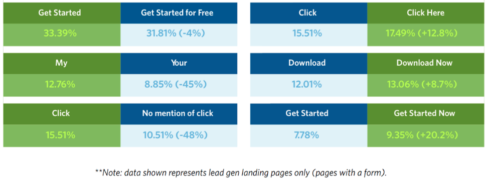 Source: Unbounce
It’s always worth regularly A/B testing the keywords you use for your landing pages so you can adjust your language as your audience evolves.
The finish line is in sight.
There’s just one more principle of conversion-centred design to go: continuance – getting your new customers to take another step after conversion. A step that leads to more value for you.