Principle 2:
Context
author
Charlotte
10 April 2019
The 7 Principles of Conversion-Centered Landing Page Design: Context
Context: The second principle of conversion-centered design.
Welcome back, comrades. Wait, have we not spoken before? Then you need to read the first two blogs in this series. Go on, off you go. We’ll still be here.
*Whistles, taps feet, makes a cup of tea…*
Okay, you back with us? Good, let’s continue.
Context is our second principle of conversion-centered design. It’s how you get prospects to connect your campaign’s dots so they feel confident that what you’re offering is worth their time.
How to crack context.
Context needs to come into play immediately before and after prospects click on your advert. Which means your ad needs to clearly outline what you offer and your landing page needs to live up to your words.
Failure to deliver on the promise you made in your ad equals a botched campaign.
Here’s how to get enthusiastic clicks rather than sad back-button taps.
Pre-click.
You want that enticing button on your ad to be used, not gathering dust. But ads don’t always give you a lot of room to develop context. For example, on a Facebook ad, you’re limited to 145 characters and an image. It’s a similar story for Twitter and LinkedIn.
You can’t always give prospects all the details of your campaign through an advert. But your traffic source can leave enticing breadcrumbs that lead visitors to your landing page.
You can see what we mean in the example below:
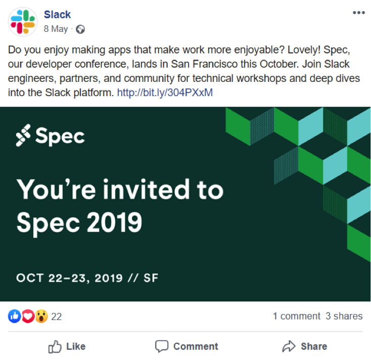
Source: Slack
Slack, the team collaboration software developer, advertises its upcoming conference using a Facebook ad. It has included critical tidbits in the snippet – the what, why, where and when of the event – giving users just enough context to pique their interest.
This persuades visitors to explore further, and then the landing page can do the heavy lifting when it comes to adding more context. Get the idea?
Post-click.
Now you need to look at the content on your traffic source and ask yourself two crucial questions:
1. What information is missing?
2. What needs to happen to complete the experience?
Let’s do a little ‘spot the difference’ activity. Take a look at Slack’s landing page for its event and try to identify the information that doesn’t appear on the ad:
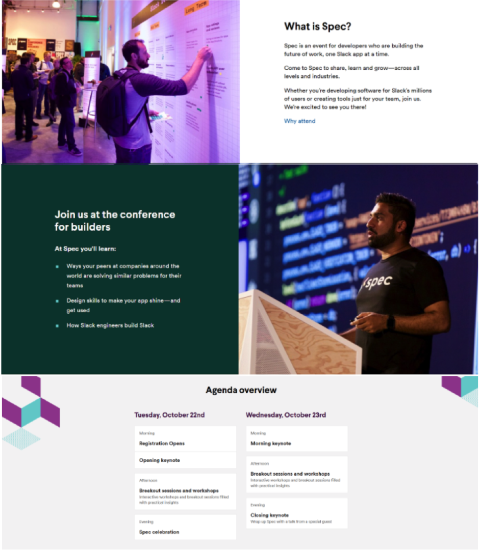
Source: Slack
As you can see, the copy on Slack’s landing page echoes that of its traffic source. But it also digs deeper into what attendees can expect from the event. This is what it includes that doesn’t feature on the ad:
- What delegates will learn
- Why they should care
- Speakers at the event
- What the experience entails
- How to prepare
- The event’s agenda
- Pricing
Slack has done a great job of elaborating on the event’s benefits and details to give visitors that much-needed extra context to confidently register. All the while ensuring its traffic source can easily be connected to the landing page. But adding context doesn’t stop there…
Two matches made in context heaven
To help you maintain context from your traffic source to your landing page, you can use these two concepts:
1. Message match – your landing page’s headline needs to closely match the headline or call to action on your advert so there’s no question that the two are related.
2. Design match – similarly, the hero shot (main image) and colour palette on your traffic source and landing page should be identical.
Feast your eyes on the advert and landing page below:
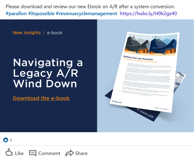
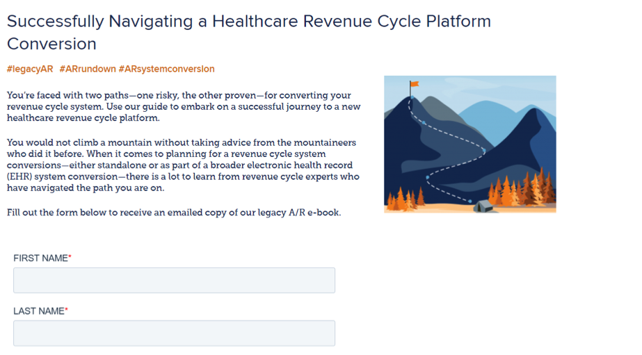
Source: Parallon
See how the headline, hero image and colour palette on the landing page are very similar (and in some cases identical) to the ad’s elements? We call this a strong coupling – the message match and design match are working together to create interconnectivity between the two channels.
This reassures the visitor that they’ve come to the right place, so they don’t have to break sweat re-interpreting the landing page and easily digest the remaining content. This keeps them around for longer and increases the chances that they’ll convert.
A context fail
Here’s an example of a disjointed user experience because of several context fails between the traffic source and landing page:
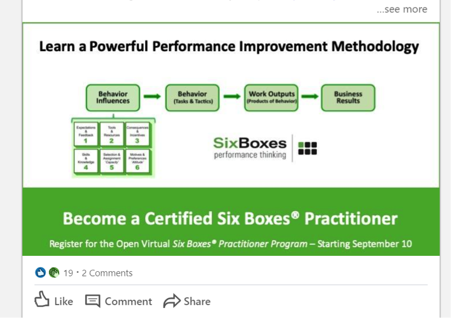
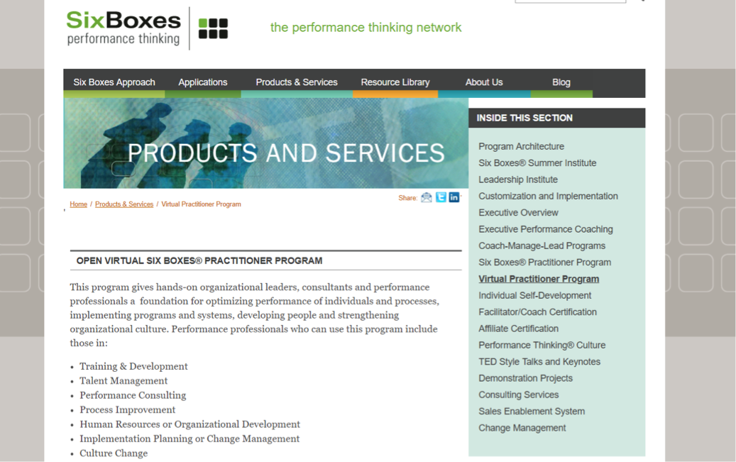
Source: Six Boxes
See how the company lacks an above-the-fold attention-grabbing headline on its landing page? Whereas on the LinkedIn ad, it has a compelling headline that clearly communicates what’s on offer.
Consequently, when a user clicks on the link and arrives on the landing page, they have to scour the wordy content below “Products and Services” to decipher the value of the program offered to them. This is a big context fail – it makes the visitor work harder than they should, increasing the risk that they won’t engage with your content.
Not only that but the colours and images used on the advert are not seen on the landing page. So the first thing that comes to mind on arrival is: “Did I click on the right link?” This is the LAST thing you want your prospect to think. As Matt Umbro, Associate Director of Search at Hanapin Marketing puts it:
“Context is the why behind the what and allows for a better understanding of what we consume.”
Without the ‘why’, visitors will fail to understand your intention and will look elsewhere for a company that can offer greater value and meaning behind their offering.
Putting everything into context.
Nailing good context isn’t difficult but you’d be surprised at how many businesses fail to create a good contextual bond between their traffic source and landing page.
But you’re not going to make this mistake. Because you know how to master context pre-click and post-click, and the ways Message Match and Design Match can help you develop strong contextual relationships.
With this knowledge, you’re ready for the next step, the third principle of conversion-centered design: clarity.